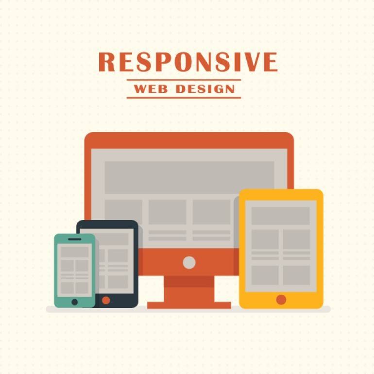
 First of all lets define a “mobile device”.
Palm tops and Smartphones are definitely included, but what about smaller phones? The Nokia N-Series does have a good browser which is almost there but certainly other smaller phones have browsers that cannot read normal website mark-up and often when they do are in such a format that the user doesn’t want to view it. So there are two types of mobile devices, the Smart Phones and normal mobile phones. There are so many different versions of browsers on small handsets that to build websites that work in them all will take too long. Therefore it is better to simply build in simple HTML which will satisfy most types.
Now we need to look at the website. What are you showing on your website? For sure websites like Facebook, Google and other websites that you are likely to want to look at while sat at the bus-stop need to have copies of their websites which are optimised for mobile devices. If you are selling heavy machinery for £50,000 each then the chances of someone browsing from a bus-stop are remote, however if you have a social-networking site then the answer is probably yes.
If the answer is yes, your website does need to be optimised for mobile devices then there are two options availble. 1, Do we build a whole new mobile-device optimised copy of the website which runs behind the actual fully feature-rich website or 2, do we build the original website to allow for easy visibility for mobile phones. Building an optimised copy of the website is basically building a second website (although it will pull off of the same database so background administration areas won’t need duplicating) so there will be the extra charge for this.
If you are building a mobile-device optimised copy of the website then there are some simple guidelines to abide by.
- Do not use multiply columns, have all pages utilising a top-down approach with no left-to-right scrolling.
- Do not use any graphics for decoration, all images should be useful to the content of the pages. I.e. no images for rounded corners or gradient backgrounds.
- Keep external files (e.g. Javascript and Stylesheets) to a minimum. It is very easy to build one stylesheet for your entire website and keep piling all your styles into it for every page. While this is fine for normal computer browsers it causes unneeded download and processing for mobile devices. Instead have a styles (and javascript) used on every page in one stylesheet and styles used only on one or two pages listed in a separate file which is then only linked to on the specific page.
- Get to the main body content quickly. Keep unnecessary links (i.e. home, about us, contact us, terms and conditions) at the bottom of the page. Only show links at the top which you feel are particularly relevant to the page that you feel the user would want to visit.
- In short, assume that the user has a really show connection and a really bad processor for compiling and showing the page.
If you decide to build your main website to be mobile-device “friendly” then again there are some simple guidelines to follow. This option is really only advised if you are not wanting the website to work on smaller phones. This type of mobile-device should then be assumed to be a Smartphone. Smartphones have fully-functional browsers capable of showing the same content as a normal computer browser however you can make the experience easier for the user:
- Keep your content in a grid format, with columns and the contents of the columns into neat boxes. This utilises the easy scrolling of the Smartphone and the auto-zoom (i.e. the really useful auto-zoom on the iPhone).
- Like stated previously, Keep external files (e.g. Javascript and Stylesheets) to a minimum, as it still has to be assumed that the user has a bad Internet connection and the processor still won’t be as good as a computer.
- Use a left-column for the navigation. This means the user can quickly zoom in on the menu and read it as they scroll up and down. Whereas the user will be unable to auto-zoom on a horizontal navigation.
- Do not use Flash. Currently this is not yet supported on the iPhone and undoubtedly others too which means the user will simply get an ugly grey box instead.
If in doubt, talk to your web developers (E.g. Globalgraphics) and ask them what they think. Your web developers should be thought of as consultants, so talk to them and ask their opinion.
So to answer the original question: Do web developers need to build for mobile devices? In the current market, yes and no, it all depends on the website and the target audience. However SmartPhones are only going to get smaller, connection speeds faster and therefore more popular and so soon all website will need to think about being mobile-device optimised.


